Guidelines Home
EBONI Home
Hardware design On-screen design Next Bibliography Index Guideline 22 Guideline 21 Guideline 20 Guideline 19 Guideline 18 Guideline 17 Guideline 16 Guideline 15 Guideline 14 Guideline 13 Guideline 12 Guideline 11 Guideline 10 Guideline 9 Guideline 8 Guideline 7 Guideline 6 Guideline 5 Guideline 4 Guideline 3 Guideline 2 Guideline 1 Introduction Table of contents Previous

Hardware design On-screen design Next Bibliography Index Guideline 22 Guideline 21 Guideline 20 Guideline 19 Guideline 18 Guideline 17 Guideline 16 Guideline 15 Guideline 14 Guideline 13 Guideline 12 Guideline 11 Guideline 10 Guideline 9 Guideline 8 Guideline 7 Guideline 6 Guideline 5 Guideline 4 Guideline 3 Guideline 2 Guideline 1 Introduction Table of contents Previous On-screen design Hardware design Next page Bibliography Index Guideline 20 Guideline 19 Guideline 18 Guideline 17 Guideline 16 Guideline 15 Guideline 14 Guideline 13 Guideline 12 Guideline 11 Guideline 10 Guideline 9 Guideline 8 Guideline 7 Guideline 6 Guideline 5 Guideline 4 Guideline 3 Guideline 2 Guideline 1 Introduction Table of contents Previous page

"Sometimes a bit busy. A lot of stuff was on the screen at any one time, not great if in a hurry"

Participant in EBONI psychology evaluation

Readers expect the typographical sophistication of the printed page, and pagination has to be designed carefully to enhance readability. Line lengths similar to that of the printed page (10 to 15 words) are preferred, punctuated with plenty of white space to give each page a clean, uncluttered appearance. Paragraphs should be left-justified, providing a uniform starting point for each line and enabling the reader to scan the text effectively. The typographical style should be consistent throughout the book.


7.1 Include plenty of white space to provide page borders
7.2 Use line lengths of 10 to 15 words, in the centre of the page
7.3 Left-justify text


Consult the following recommendations from the W3C Web Content Accessibility Guidelines 1.0:
Guideline 3: Use markup and style sheets and do so properly
Guideline 5: Create tables that transform gracefully
Guideline 14: Ensure that documents are clear and simple

Figure 6

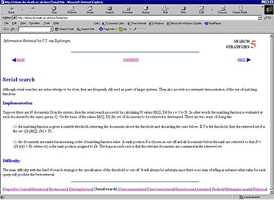
Figure 7. Example of clear layout: Information Retrieval by Keith van Rijsbergen, redesigned by Ruth Wilson

This chapter of Information Retrieval, redesigned for EBONI's evaluations, uses clear headings, lots of white space and has a clean appearance, although users found the lines of text, spanning from one edge of the screen to the other, too long and therefore difficult to scan.

Click to enlarge


© EBONI 2000-2002
Screenshot used with author's permission